Vom Einfachen das Beste
tobel 1853

- Project:
- Brand · Corporate Identity
- Client:
- —
- Year:
- —
Hospitality adds meaning. We started where it already is.
Holiday brands love to charge their offer with meaning from the outside. Organic. Vegan. Wellness. Then they build into the very nature they claim to protect. Meaning becomes a claim. Scenery.
tobel1853 is a restored farmstead in the Allgäu, in the same family since 1853: apartments, bistro, events, retreats. A place like that doesn’t need meaning added. It needs a brand that starts where the meaning already is, at the origin, and makes it possible to find your way back to it.
That became the idea. People who stay here are not looking to forget. They are looking to remember where they come from.
The connection they find is not complicated. It is surprisingly simple, simpler than we are used to in everyday life. So the line was clear: Vom Einfachen das Beste. Honest food, sustainable craft, deep respect for nature. Real richness lies not in abundance, but in conscious choice.
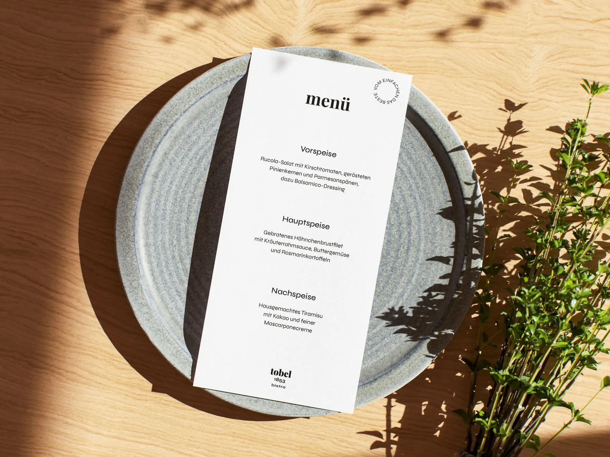
We built the brand strategy and the entire corporate design on that line. Everything a guest meets follows the same principle: reduction to what matters.
Not an escape. An arrival.
Playfair Display Bold
18 pt
The best from the simple: honest food, sustainable craft and deep respect for nature.
Syne Regular
14 pt
The best from the simple: honest food, sustainable craft and deep respect for nature.
10 pt
The best from the simple: honest food, sustainable craft and deep respect for nature.
8 pt
The best from the simple: honest food, sustainable craft and deep respect for nature.
Classic in form. Modern in function.
The design follows one principle: reduction. Not as a style, but as a decision. Every choice answers a single question: does it serve what matters?
So we kept what lasts and cut what performs. The form is classic: calm, confident, rooted in a place that has stood since 1853. The function is modern: clear, flexible, built for screens and for paper alike. Timeless elegance meets precision. Aesthetics and purpose become one.
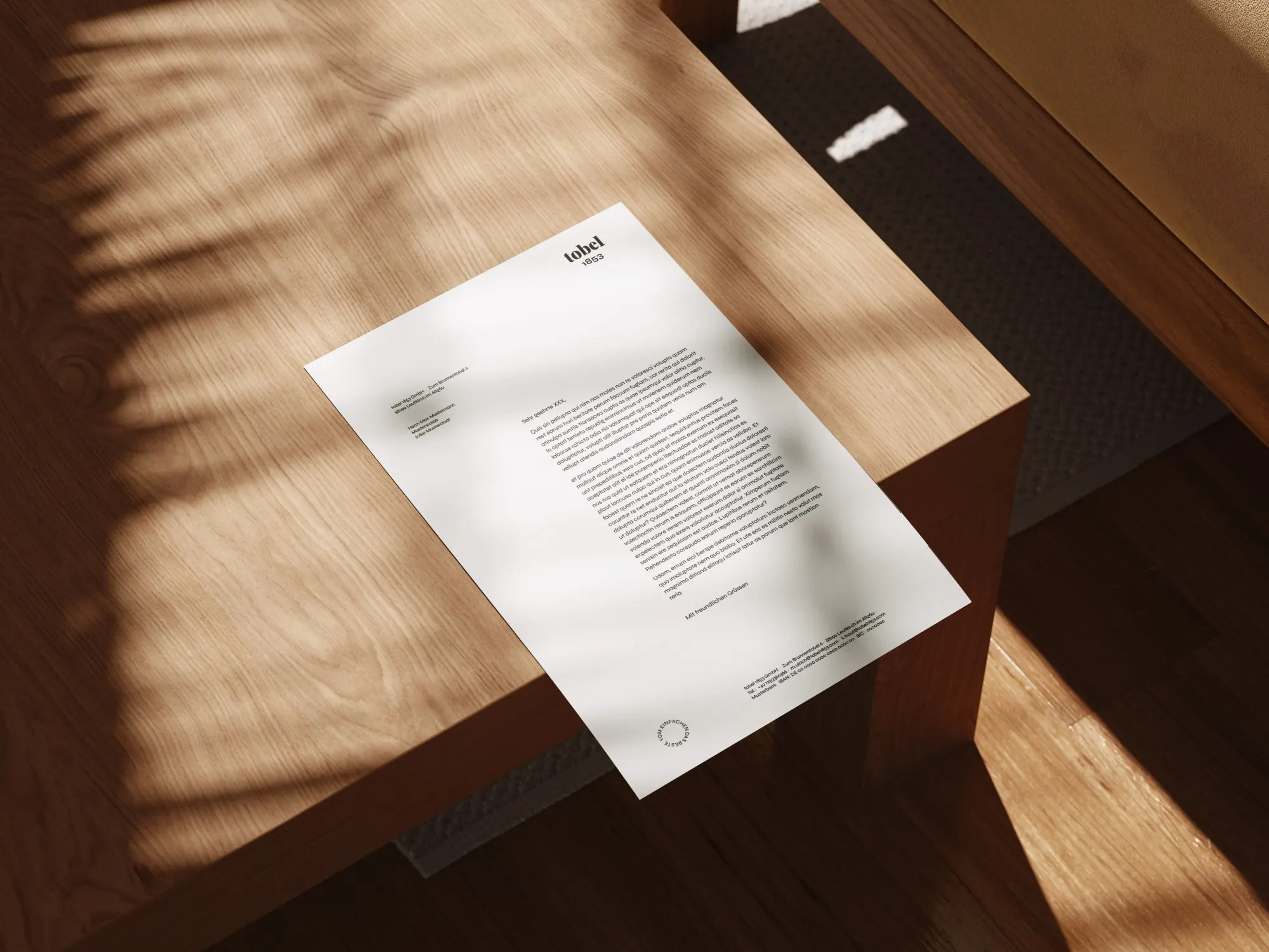
The name stands in lowercase, with the year beside it. No logo that performs, a mark that simply stands, like the farmstead itself.
The same calm runs through everything a guest touches, from the website to the printed page. Inviting. Clear. Generous. Nothing is decoration. Nothing is noise.
That is why the brand never needed a label. Others tell you what a place means. tobel1853 shows it, in proportions, in materials, in what is left out.
Vom Einfachen das Beste. The best from the simple.



Skip the echo chamber